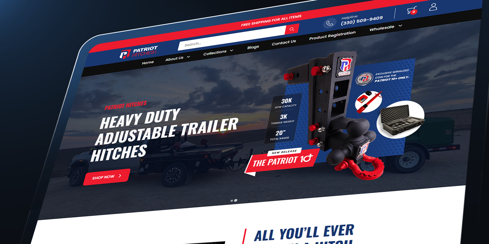
This article covers the technical decisions behind building this system. Each section explores a different layer of the architecture.
The Problem with Generic Themes
Patriot Hitches sells heavy-duty adjustable trailer hitches — a technical product with multiple configurations, compatibility requirements, and buyer personas ranging from individual truck owners to commercial fleet managers. Their previous Shopify setup used a generic theme that wasn't built for any of this.
→Products were displayed in a flat, undifferentiated grid with no hierarchy
→Technical specifications were buried in long description blocks
→Navigation had no logical grouping by hitch type, use-case, or product family
→The theme had no modular structure — every edit risked breaking something else
→Mobile experience was an afterthought — critical product details were cut off
The core issue wasn't visual — it was structural. The theme didn't understand the product catalog, so it couldn't present it clearly. A redesign without a rebuild would have just painted over the same problems.
Starting with Architecture
Before writing a single line of Liquid, I mapped the product catalog and defined the information hierarchy. This is the step most Shopify developers skip — and it's the reason most theme rebuilds feel the same as what came before.
The catalog broke down into three clear levels:
→Product Family — Adjustable Hitches, Fixed Hitches, Accessories
→Product Type — Ball Mounts, Shank Adapters, Hitch Pins, Weight Distribution
→Configuration — Rise/Drop, Shank Size, Ball Size, Weight Capacity
Once the hierarchy was clear, the template structure followed naturally. Each level maps to a Shopify object: collections for families, product types for filtering, metafields for technical configurations.
THEME_ARCHITECTURE⧉
theme/
├── layout/
│   └── theme.liquid          # Global layout shell
├── templates/
│   ├── index.json            # Homepage — section groups
│   ├── collection.json       # Collection pages
│   ├── product.json          # Product pages
│   └── page.json             # Static pages
├── sections/
│   ├── hero-banner.liquid    # Homepage hero
│   ├── product-grid.liquid   # Collection product grid
│   ├── product-specs.liquid  # Technical specifications
│   ├── product-gallery.liquid
│   ├── nav-mega.liquid       # Mega menu navigation
│   ├── featured-products.liquid
│   └── trust-bar.liquid      # Shipping, warranty, support
├── snippets/
│   ├── product-card.liquid   # Reusable product card
│   ├── spec-row.liquid       # Single spec line item
│   └── badge.liquid          # Product badges
└── assets/
    ├── theme.css
    └── theme.js
Everything in sections/ is independently configurable from the Shopify theme editor. Business owners can reorder, hide, or customize any section without touching code.
Modular Liquid Sections
The most important architectural decision in a Shopify theme is how you structure sections. A section should do one thing, accept its own schema settings, and have no dependencies on other sections.
sections/product-specs.liquid⧉
{% comment %} Product Specifications Section {% endcomment %}

<div class="product-specs" id="specs">
  <h2 class="specs__title">{{ section.settings.title }}</h2>

  <div class="specs__grid">
    {% if product.metafields.specs.rise_drop %}
      {% render 'spec-row',
        label: 'Rise / Drop',
        value: product.metafields.specs.rise_drop
      %}
    {% endif %}
  </div>
</div>

{% schema %}
{
  "name": "Product Specifications",
  "settings": [
    {
      "type": "text",
      "id": "title",
      "default": "Technical Specifications"
    }
  ]
}
{% endschema %}
The {% schema %} block makes every section configurable in the theme editor. The {% render %} tag keeps snippets isolated — they can't access variables outside their own scope, which prevents the kind of side effects that make themes hard to maintain.
Product Page Structure
The product page is where most industrial Shopify themes fall apart. They use a two-column layout — image left, add-to-cart right — and dump everything else into a long description. Buyers looking for compatibility specs have to scroll through marketing copy to find them.
I restructured the product page into clear zones:
→Zone 1 — Gallery + Variant Selector + Add to Cart (above fold)
→Zone 2 — Technical Specifications (tabbed, immediately below)
→Zone 3 — Compatibility Information (fitment guide)
→Zone 4 — Related Products (same product family)
→Zone 5 — Trust Signals (warranty, shipping, support)
snippets/product-card.liquid⧉
{% comment %} Reusable Product Card {% endcomment %}

<article class="product-card">
  <a href="{{ product.url }}">
    <div class="product-card__image">
      <img
        src="{{ product.featured_image | image_url: width: 400 }}"
        loading="lazy"
      >
      {% if product.metafields.badges.is_new %}
        {% render 'badge', label: 'NEW' %}
      {% endif %}
    </div>
    <div class="product-card__info">
      <h3>{{ product.title }}</h3>
      {% if product.metafields.specs.weight_capacity %}
        <p>Up to {{ product.metafields.specs.weight_capacity }}</p>
      {% endif %}
      <p>{{ product.price | money }}</p>
    </div>
  </a>
</article>
The card renders a key spec — weight capacity — directly on the collection grid. Buyers can compare products without clicking into each one. This single change reduced the navigation depth required to make a purchase decision.
Navigation & Filtering
The original navigation was a flat list of product names. No grouping, no hierarchy, no indication of what category a product belonged to. For a catalog with 50+ SKUs across multiple product families, this was unusable.
I rebuilt navigation as a mega menu organized by product family:
sections/nav-mega.liquid⧉
<nav class="nav" role="navigation">
  <ul class="nav__list">
    {% for link in linklists.main-menu.links %}
      <li class="nav__item">
        <a href="{{ link.url }}">{{ link.title }}</a>

        {% if link.links.size > 0 %}
          <div class="nav__dropdown">
            {% for child in link.links %}
              <a href="{{ child.url }}">
                <span>{{ child.title }}</span>
                {% if child.object.description != blank %}
                  <span>{{ child.object.description | truncate: 60 }}</span>
                {% endif %}
              </a>
            {% endfor %}
          </div>
        {% endif %}
      </li>
    {% endfor %}
  </ul>
</nav>
The mega menu reads from Shopify's link list system — no hardcoded navigation. Business owners update the menu structure in the Shopify admin without touching theme code.
Performance Considerations
A Shopify theme has fewer performance levers than a custom web app, but the ones that matter are significant.
→Images — use image_url filter with explicit width, lazy load everything below fold
→Scripts — defer all non-critical JS, avoid jQuery, use vanilla JS for interactions
→CSS — single compiled stylesheet, no render-blocking CSS imports
→Fonts — preconnect to font CDN, use font-display: swap
→Liquid — minimize logic in loops, use cache-friendly filters
→Sections — avoid deeply nested section renders that increase render time
layout/theme.liquid⧉
<!DOCTYPE html>
<html lang="{{ request.locale.iso_code }}">
<head>
  <meta charset="utf-8">

  <!-- Preconnect for performance -->
  <link rel="preconnect" href="https://cdn.shopify.com">

  {{ content_for_header }}

  <!-- Single stylesheet -->
  {{ 'theme.css' | asset_url | stylesheet_tag }}
</head>
<body>
  {% section 'nav-mega' %}
  <main>{{ content_for_layout }}</main>
  {% section 'footer' %}

  <!-- Deferred scripts -->
  {{ 'theme.js' | asset_url | script_tag }}
</body>
</html>
Key Takeaways
ARCHITECTURE BEFORE AESTHETICS
Map the product catalog and define the information hierarchy before writing a single line of Liquid. The template structure should follow naturally from the domain.
SECTIONS ARE YOUR API
Every section should be independently configurable via schema settings. Business owners should never need to touch code to update content or layout.
SNIPPETS ENFORCE ISOLATION
Use render tags instead of include — snippets can't access parent scope variables, which prevents side effects and makes the theme predictable to maintain.
PERFORMANCE IS STRUCTURAL
The biggest performance wins in Shopify come from structure — lazy loading, deferred scripts, single stylesheets — not micro-optimizations after the fact.